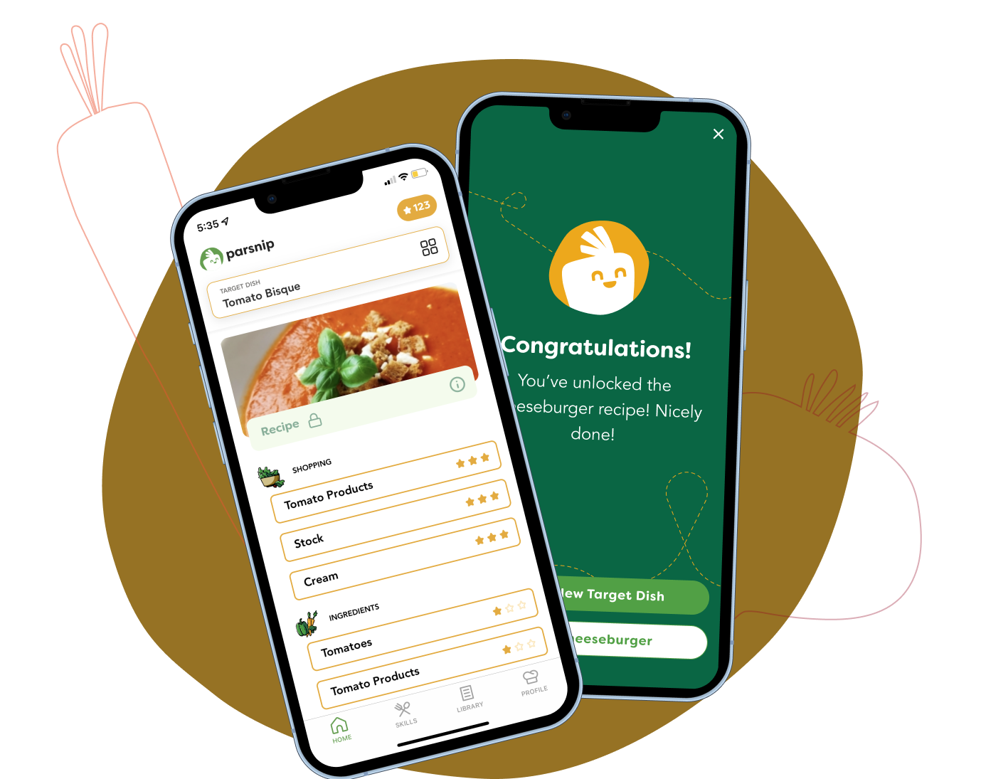
Mobile app core experience redesign for cooking learning platform
Duration:
8 Months
Team:
1 Product Designer (Me), 1 User Researcher,1 PM, 5 Developers
Tools:
Figma, Jira, Amplitude, Miro, Procreate, Photoshop, Illustrator, Adobe Effects
My Roles:
UXUI - User story, Wireframing, Prototyping, Mockups, Design QA
Product Vision - Competitive Analysis, User Research & Interviews, UX Roadmap Management
Others - Leveraging & restructuring the existing design system, Badge Design, Illustration
✱ 30,000 downloads and 6,000 accounts created since Parsnip iOS has been launched (7 months)
Problem
Cooking is a challenge and it frustrates beginners.
Solution
Parsnip.ai is an AI application for learning cooking skills and recipe instructions.
Challenge
Establishing a cooking knowledge system is still a relatively new concept to beginners. It’s crucial to design a smooth and enjoyable experience to increase the number of returning users.
Results as of 2023.05
✱ Over doubled the user activation rate by implementing onboarding flow, and gamification
✱ Weekly retention consistently around 20–25% as long as 4 months from the first use
✱ 4.9⭐ on iOS with over 300 ratings, with Positive valuable qualitative feedback →

Understanding the Cooking Tech Trees
Our team’s goal is to allow people to pick any recipe from the Internet, and break it down in our App to learn to cook it well.
However, even the greatest technologies can be rendered useless if not presented in a user-friendly manner.

Formulate a curriculum flow that leverages the cooking tech tree, launched MVP design flows.
Design Approach
Adheres to agile development, the reverse double diamond approach ensures a fast-paced iteration balancing business objectives with user-centric experiences.
Conduct user interviews, secondary research, analyzing data to define main problems and user pain points.
I came up with solutions and prioritized them with team, quickly drew wireframs to review and evaluate.
Put the new design ticket to Jira, developer team launch the new design. Start a new round of user testing, and iterating based on quantitative data and qualitative feedback.
Team decide on the best designs, I developed the prototypes and tested with our existing and potential users to decide on which solution that best solved user needs and is the most user-friendly.
Discovering Issues & Iterating on Opportunities
To thoroughly investigate hidden product challenges and App usability issues, I conducted user interviews after identifying issues through Amplitude analysis.
Empathize with users
We talked to 30+ existing and 20+ potential users who showed interest in our product to better understand our users’ pain points, needs, and motivations. They are from 20 - 40 years old and have the following shared background and cooking habits:
They want to systematically learn cooking and upgrade their skills ;
They are not confident in kitchen techniques or are frustrated by the procedures.
We asked the participants to go through the entire experience with the original app: get familiar with the app, select a dish, play levels, view the recipe, and view the skill progress. This was to observe and capture their reactions, then identify the underlying problems in different steps.
Competitive Research
I analyzed our direct (recipe and technique-focused, e.g. Yummly ) and indirect competitors (teaching executions, e.g. Duolingo) to learn from design strategies.
The critical functionalities in these apps consist of learning skills, cooking recipes, progress tracking, and an incentive system.
Define Problems
The biggest challenge with using our app is confusion, motivation, and easy filtering of the content users want to view.
Identify Opportunities
How do we help users get familiar with the app more easily?
How can we encourage users to engage with our app daily?
Framing research insights into How Might We questions, I sketched the design ideas, and led the team to discuss solutions
💯
🎲
🥘
What’s the best way to navigate through layered recipes?
We gained insights into users’ pain points by conducting a round of usability testing:
Iteration B & Iteration C
⚠️
Design Solutions
Q1. How do we help users get familiar with the app more easily?
However, Amplitude Analysis showed that 80% of users dropped off the game after completing the onboarding path, which indicates usability problems that need to be addressed.
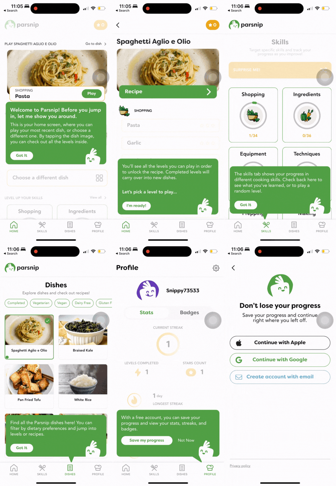
Iteration C. Active Onboarding Tutorial with multiple tooltips design explorations
Iteration D
I tested the prototype with several individuals close to me, the feedback was overwhelmingly positive. However, these positive reactions often came after they spent some time with the app and became accustomed to its unique mode of "learning to cook through quizzes.
The initial inconsistency arose from the novelty of our approach, as users hadn't encountered such an experience before.
👇
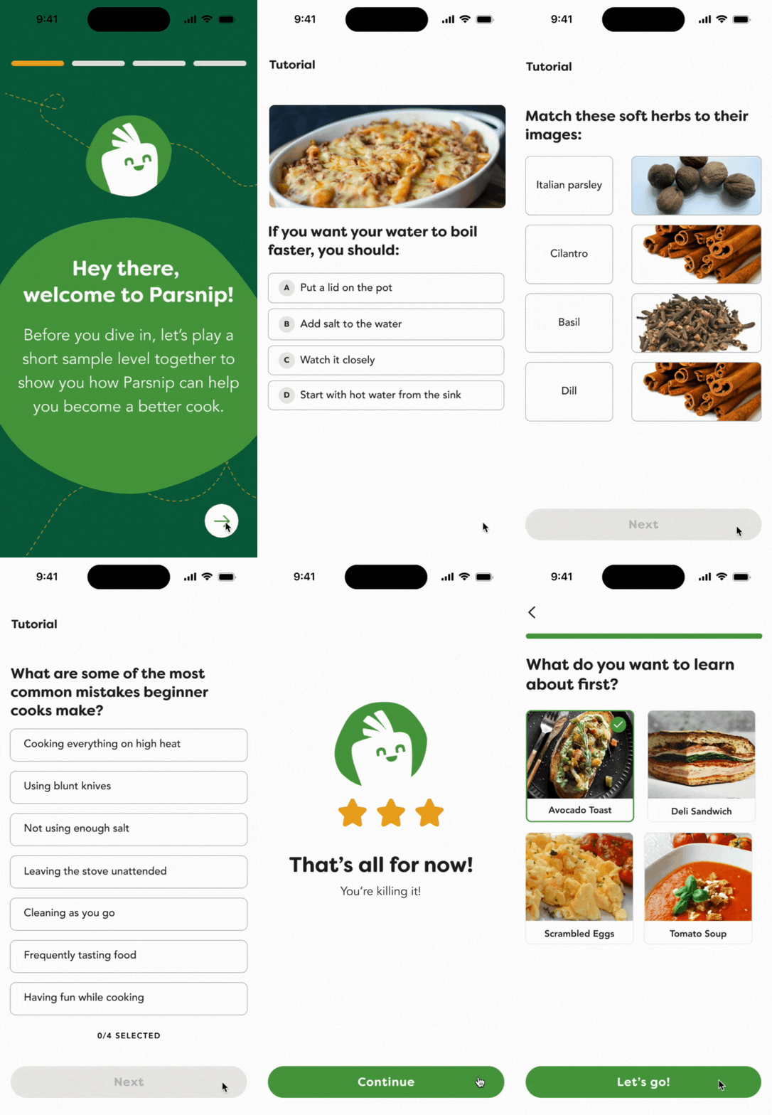
Iteration B. Contextual Screen-by-screen Tutorial
Why not introduce users to the quiz-style learning during the onboarding process?
Iteration D. The interaction flow of game-play in the onboarding path
“Target dish” is confusing;
Have no idea about what’s going to happen after “first level”;
Users thought the tech tree is confusing, and it’s clickable;
Inconsistency and disconnection during the onboarding;
Users remain uncertain about how to begin a level when returning to the app.
After auditing competitors, I came up with different design solutions.
I replaced the tech tree with a Contextual Screen-by-screen Tutorial, which walks users through the process before attempting the task to gain a thorough understanding;
I designed a Just in time Tutorial (active onboarding path), which is triggered by users’ actions, aiming to address issues in real-time and focus on current user needs.
Mixed Feedback from internal stakeholders
They appreciate the interactive onboarding, and it aligns well with the development team's capabilities for easy implementation.
The founder expressed concerns that merely adding more screens to explain the gameplay and level completion might not fully alleviate the users' confusion.
✅
Iteration A
Initially, I designed the onboarding to introduce the tech tree, and to collect users’ cooking experience in order to tailor notifications, creating a personalized learning map.
Why it didn’t work

Screen-by-screen sample level demonstrations
Final Design - Clickable Prototype
The final version consists of refined sample-level gameplay and active onboarding tips, reducing user confusion from our novel learning approach and quickly familiarizing them with the app.
Just in time tutorials
(Active Onboarding)
Design Process
Q2. How can we encourage users to engage with our app daily?
Initial design solutions
In order to encourage users to engage with our app more, combining their frustration when user interacting with the app in previous experience, I came up with multiple design solutions such as:
Using color shades to differentiate correct/wrong answer;
Designing more quiz types to add playfulness;
Adding an explainer to each question;
Cross out the wrong answer;
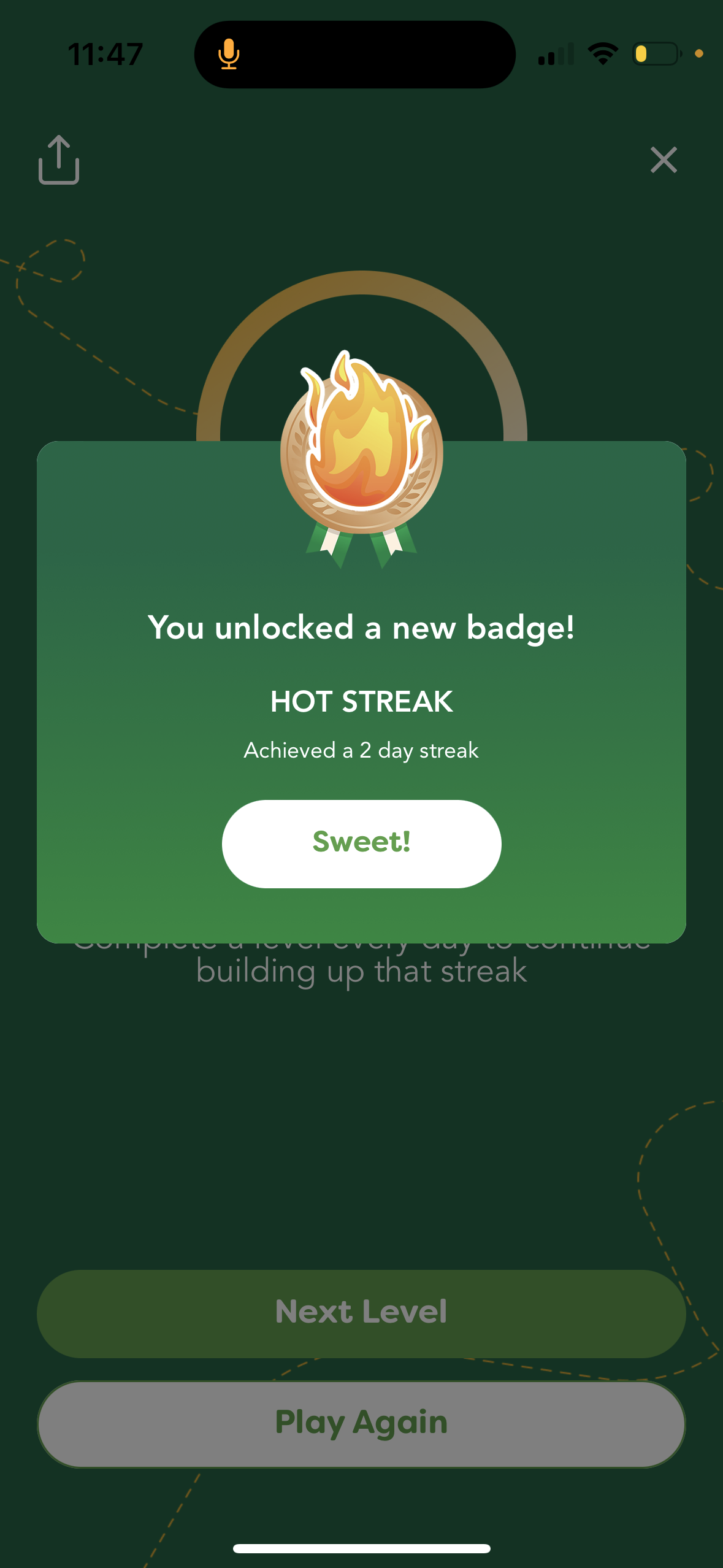
Adding streaks to encourage consistency of learning;
The design garnered mixed feedback
The team had mixed opinions due to varying objectives, for example, Integrating videos and links into the recipe page received positive feedback from the founder, however, the developers noted that the implementation required additional time and effort. At the same time, our PM and UX researcher brought up different scopes and directions.
Prioritize design workshop
In order to align the disagreements within the team, I proposed the Prioritization Matrices to inform the design decisions based on the business impact and development efforts.
I invited stakeholders(founder, PM, UX researcher, content writer, and the development team) to join the design workshop, after prioritizing, we decided to move forward with ideas in “High impacts/values” across “Low efforts”.

The new design solved the problem of user frustration during quizzing and learning, shortening the time to complete a level. Triggering users’ interests and improving their confidence in forming a learning habit.
Final Design - Clickable Prototype
“This new quiz interaction flow is much better than before, grey-cross out narrowed down to the correct answer for me, I learnt new knowledge after playing a level.”
“I love the design of the streak. I’d wish to invite my friends in and to look at their score and streaks!”
Re-validate with Users
Badges Design
On the user’s profile page, we planned a badge system. I was working on creating and iterating badges and presented to the team.
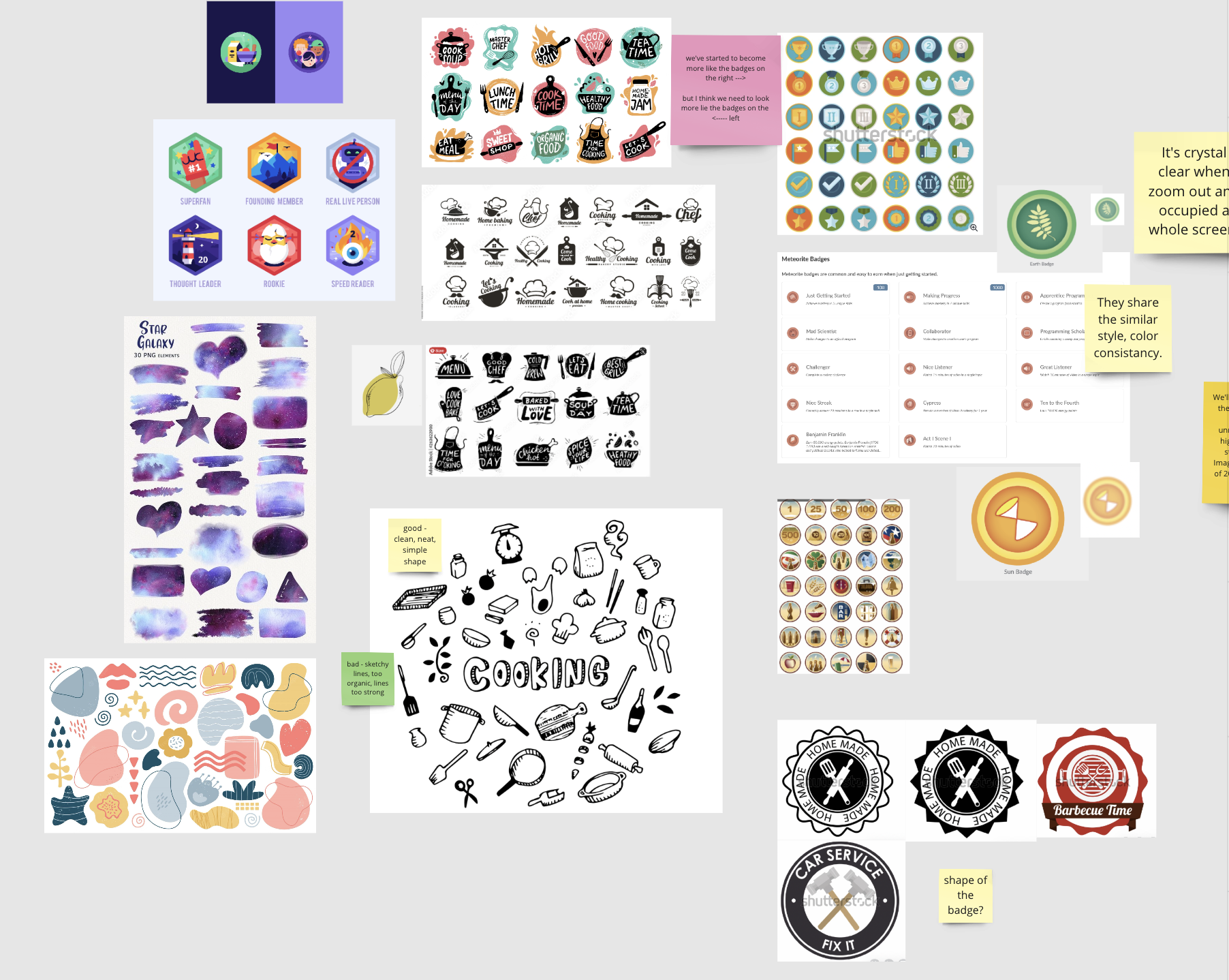
Badge design for exploring styles - sketch cycle
Badge design for cooking mood board
There are disagreements within the team.
“I think we were agree with the previous version?”
Badge UI design iteration on color & shape & line
“I like there are more nuance in the background of the badge.”
In order to align everyone’s opinions, I decided to deliver a refined design for one badge, then move to the next one, and ensure I validated the team’s objectives.
It’s a constant cycle of exploring, researching, ideating, sketching, refining, and iterating. I presented different design styles to the team twice a week during the design review meeting.
“we need to pivot to something new. The current styles not working.”
“Just explorations in shape and color, not locked into a specific design yet.”
Badge Hand-drawn design iteration on Star & background & color
“Have you seen our old illustration to get inspired? ”

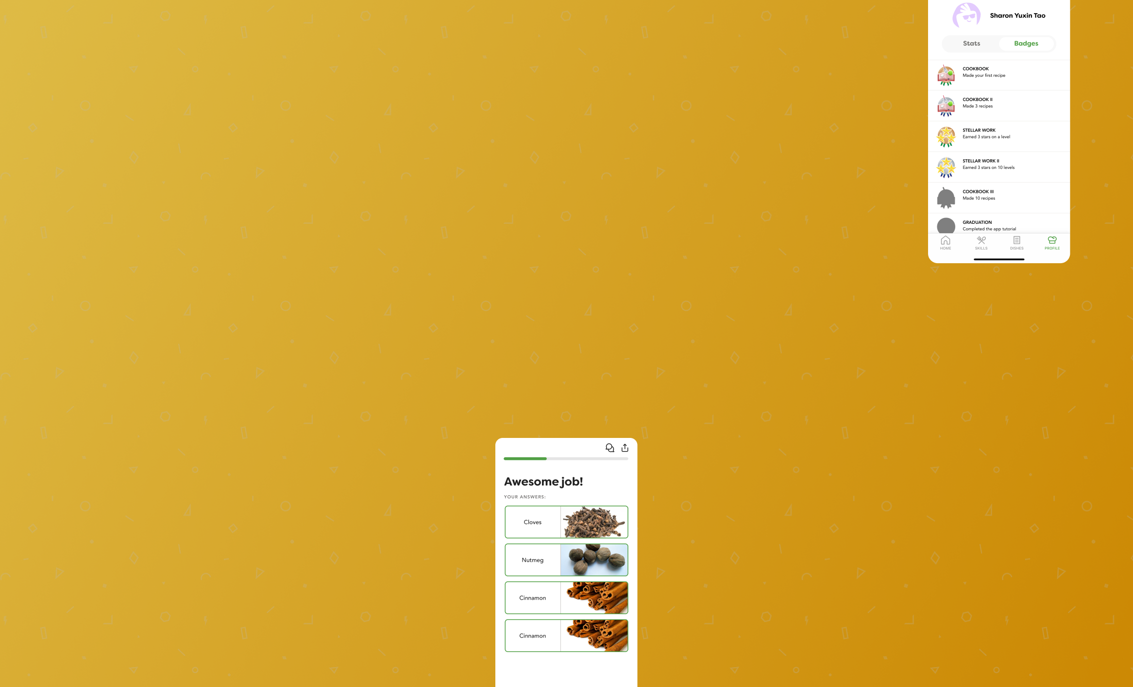
Final Badge System
6 High-level Categories, each with
3 levels of achievements
Motion GIF when pops up

📈
📲
How does the revamped app go?
Metrics and user feedback are here to tell.
🎲
💬

“You've improved it a lot already! I first tried it a while ago, found it confusing as you stated, and put it aside. I only recently picked it back up again as something enjoyable to do on my phone and not "doom scroll". This time it seemed a lot more intuitive, and I didn't even realize it was different, so I think that's a win for y'all!.”
A dad who has two 6 years old children - User from Hacker News
“The idea of a skill-tree for cooking sounds amazing. Just installed the app, the tutorial was super intuitive and easy to go through. Did the first lesson of Spaghetti aglio e olio.I would LOVE if this product existed and definitely pay for it, because I know cooking more could save me $400/month.”
A new grad who just move out of city - from Discord and Slack Community
Grow the audience, grow with our product
“What has stuck to me the most is all these little bits of knowledge, tips and tricks that I have been wondering my entire adulthood life about and never knew how to do. Seriously one of the more entertaining apps I’ve used in years, and I’m now more naturally drawn to cooking. ”
A young professional who lives by her own - User from App Store
“Well, not to brag, but this is exactly how Julia Child did "the way to cook". First few episodes were all fundamentals like how to dice, chop and julienne vegetables, how to quarter a chicken, your mother sauces, how to cook an egg, and so forth. I highly recommend it, and gamifying that system to me, would be awesome. Go Parsnip.”
A Cook Passionate - from Discord and Slack Community


