Enhance efficiency and accuracy in financial decision-making
Timeline:
4 weeks
Team:
Product owner, Financial researcher, 2 Devs
My Roles:
Product owner, Financial researcher, 2 Devs
What’s the Challenge?
The challenge was to redesign the Chart Library experience to better serve both experienced and new advisors. Experienced advisors found the process tedious, requiring too much time and effort to locate the charts they needed. They often had to navigate back and forth, which added confusion and frustration to their workflow.
For new advisors, the library felt inaccessible and overwhelming, as they struggled to understand the available content and were discouraged by the multiple clicks required to reach it. These issues underscored a significant gap between the current design and user needs, emphasizing the importance of creating a more intuitive, streamlined solution to improve efficiency and user satisfaction.
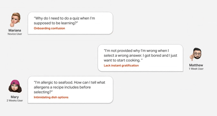
Conducted market research on charts, filters and categories, and 6 interviews to collect insights.
It’s better to prompt chart library during users’ exploration phase.
They have a smoother experience when users are able to quickly see through topics of charts.
Research to Understand Thoroughly
Conducted market research on charts, filters and categories, and 6 interviews to collect insights.
It’s better to prompt chart library during users’ exploration phase.
They have a smoother experience when users are able to quickly see through topics of charts.
Research to Understand Thoroughly
Problem Define
How can we create a seamless chart library experience (browse, select, download, and create) for both personas?
We found two main points. The first one is:
It takes too many steps to access all charts
We received X pieces of feedback from our users saying X task was tedious.
Based on the feedback I performed an audit of current experience
Solution 1
Simplify current Chart Library user flow
Solution 1
Simplify current Chart Library user flow
Explore the Design Ideas
It all begins with an idea. Maybe you want to launch a business. Maybe you want to turn a hobby into something more.
Option 1. Add Chart Library as a tab
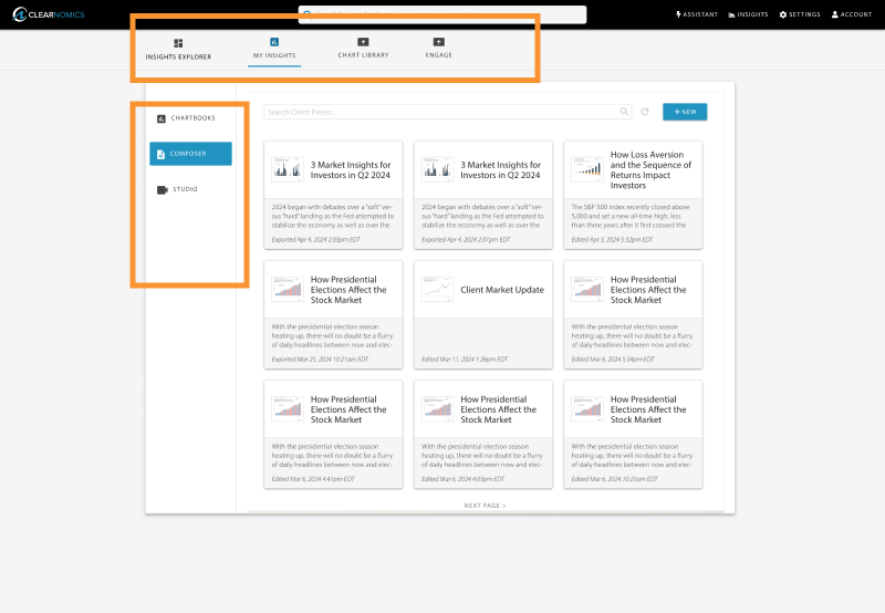
Option 2. Add Chart Library to Insights Explorer
Option 3. Revamping tabs
Evaluate Solutions & Make Decisions
Opt for Insights explorer on the homepage as the touch-point for entering Chart Library.
Solution 2
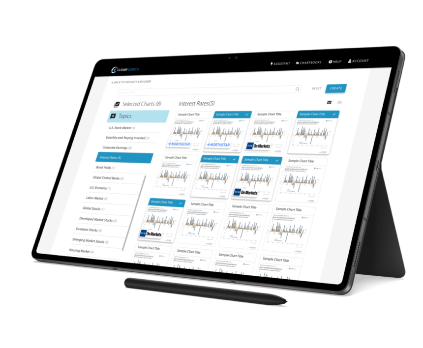
Design a new Chart Libray interface
Considering the primary requirement for simplifying the flow for exploratory user to find the chart easily, the team opted for the Top-down workflow:
Step1. User browse content in an intuitive and easy way
Step2.Select the content and then use the tool to customize and create content.
While Bottom up workflow for experienced users will remain accessible.
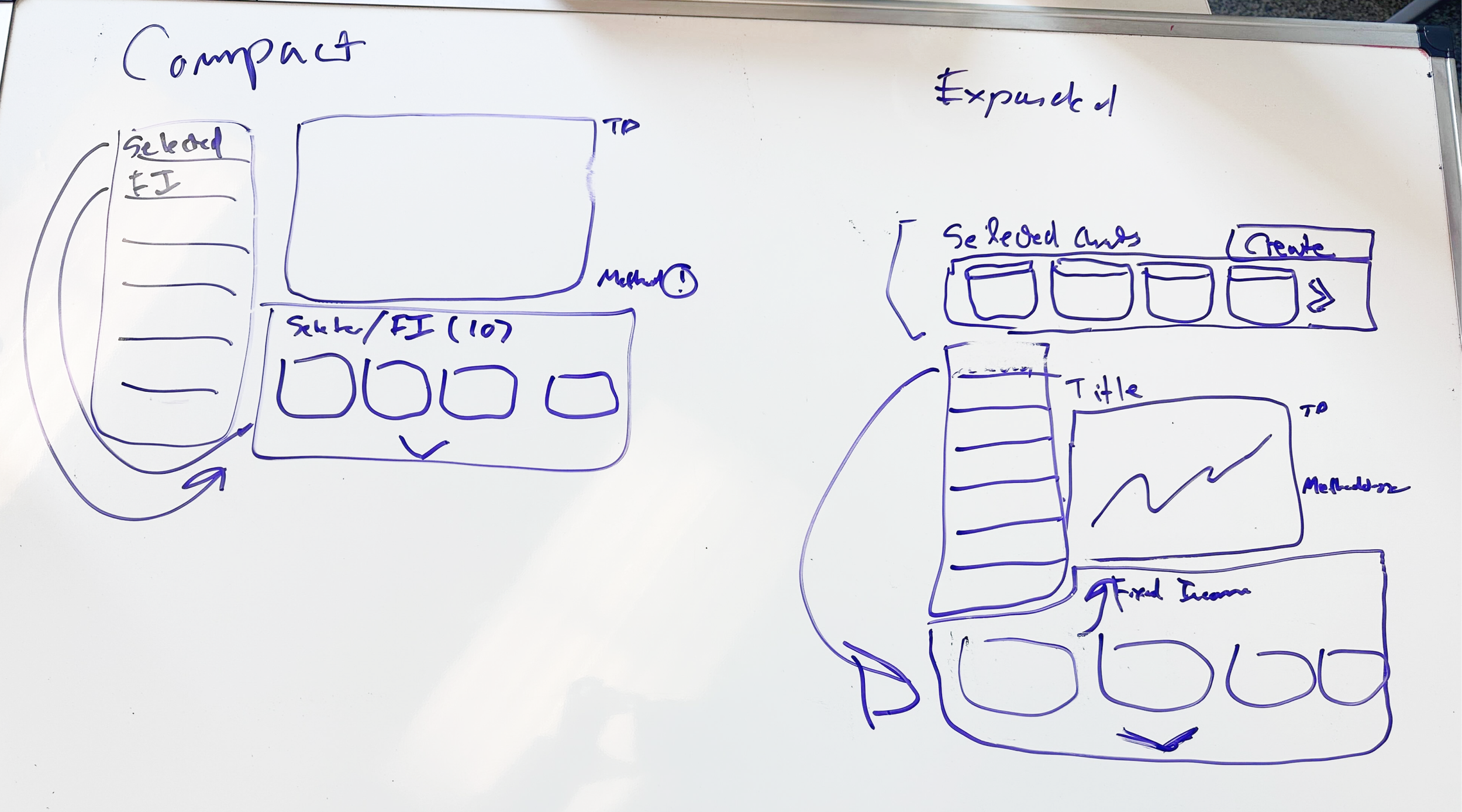
I came up with seven different designs in lo-fi
Considering the primary requirement for simplifying the flow for exploratory user to find the chart easily, the team opted for the Top-down workflow:
Step1. User browse content in an intuitive and easy way
Step2.Select the content and then use the tool to customize and create content.
While Bottom up workflow for experienced users will remain accessible.
Option 1. Add Chart Library as a tab
Option 2. Add Chart Library to Insights Explorer
Option 4. Add Chart Library as a tab
Option 4. Add Chart Library as a tab
User Painpoint 2
Chart Library is too hidden
Final Solutions
Outcomes & Business Impact
Make it stand out.
It all begins with an idea. Maybe you want to launch a business. Maybe you want to turn a hobby into something more. Or maybe you have a creative project to share with the world. Whatever it is, the way you tell your story online can make all the difference.


